home | metro santa cruz index | features | santa cruz | feature story

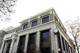
Photograph by Pete Saporito
Birthday Cake: The Rittenhouse building at Pacific and Church is giving local architects something to talk about.
Newfangled Glory
Loving and hating the Rittenhouse building
By Jessica Lussenhop
Much has been made of the unveiling of the brand new E.C. Rittenhouse building, the final missing piece in the city's 19-year-long game of post-Loma Prieta Tetris. Most of the to-do is over what's inside--that is, nothing. Nevertheless, here we are, nearing the quake's 20th anniversary, with a brand new shiny front tooth in our downtown's mug, and if the inside is a sign of hard times, the grandiose outside is certainly meant to speak of good times. The question is, do we like it?
There seem to be two schools of thought on the matter. The design, by architectural firm Baldauf Catton Von Eckartsberg in San Francisco, has a neoclassical style and Beaux-Arts flourishes likened to the Santa Cruz of old. Yet there are some, like local architect and former City Councilmember Mark Primack, who are not impressed.
"I said after the earthquake, we're going to get the downtown we deserve. I've come to realize that we deserve that building, because we created design guidelines that want people to stay inside a box, looking backward," says Primack. "We don't have the know-how and experience to create that kind of architecture."
Primack says stodgy aesthetics in our local government and an overly laborious city planning process prevent people from trying to do anything new. Hence, "It's wrong to look at the owner of the building or the architect. We all share the blame for that."
Primack has two major problems--proportions and building materials. While the style may be old-fashioned, the building materials are not. The $40,000 clock is made of fiberglass instead of more traditional cast iron, the columns are hollow and most of the outside is plaster instead of actual stone. His biggest issue with the proportions stems from the columns (too large) and the lights (too low). "Here's a building that is pulling out all the stops to appear grandiose and epic, and they hung the lights like a belt around their knees," he says. "The ornamentation, like those rams' heads--it's just disjointed, like a child placing stickers on a building."
Others, like John Chase, author of The Sidewalk Companion to Santa Cruz Architecture--the original copies of which were lost in the rubble of Plaza Books in the quake--are happy to see a nod to the town's salad days, and thinks it should be regarded with an eye on playfulness.
"I came to this all through nostalgia and affection, so that's why I get a kick out of this building," he says. "The love in the ornament and the detail--this isn't necessarily what you're supposed to like in the culture of architecture. This building probably couldn't get an AIA award. But it's what the general populace really loves, and for good reason."
Chase says he enjoys the whimsical spirit of the ornamentation, like that the animal theme ties into the other Rittenhouse facades--the roaring lions on the Henry Willey building, which houses ChefWorks, and the bears prowling the ledges of the Flat Iron building above Jamba Juice. He also loves that the garlands were hand-sketched by the designers and custom-made, as opposed to picked out of a catalog. Chase excuses the approximation of building techniques in order to achieve an old-fashioned feel, calling it a kind of "moral ambiguity" that he's fine with. "Technology has enabled materials to resemble others. That's a valid thing. Architecture has revived themes over and over and over again," he says.
Despite the difference of opinion, Primack allows that for all its shortcomings, the building could, in time, be good for Santa Cruz. "The real issue is what's happening behind those walls. If it's a sustainable businesses, good jobs, selling products that are useful, you can forgive the building," he says.
Send a letter to the editor about this story.
|
|
|
|
|
|